It’s Sunday morning and you’re fiending for a Sausage Egg McMuffin as you walk into McDonald’s. Near the checkout line you’re faced with a row of self-service kiosks and the choice to either order from a kiosk or a cashier.
That first screen you see on the kiosk (the kiosk attract screen) is a major determining factor in influencing if you opt to order from the kiosk or the teenager behind the counter.
Since the point of deploying your kiosk is to promote self-service, using the kiosk is obviously the desired outcome. In this article I’m going to cover the key components for creating an engaging kiosk attract screen to help your customers choose your kiosk over interacting with your staff.
With kiosks, it’s vital to increase customer throughput and minimize wait times. To accomplish this goal, your kiosk must incorporate the following six points.
1) Clearly communicate the kiosk’s purpose
 |
Redbox, one of the most successful interactive kiosks, makes it abundantly clear at a glance exactly what to expect when interacting with their kiosk. They do this by boldly featuring two large buttons to signal to the user that they can either a) rent movies or b) rent games.
The other functions are smaller buttons designed to draw the user’s attention to the two primary functions of the kiosk. This simplicity also serves to make first time users of the kiosk more comfortable.
2) Convey the benefit
 |
A common mistake I see is not clearly communicating the benefit of using the kiosk. The customer is always thinking “What’s in this for me?” and your kiosk needs to make this abundantly clear to them.
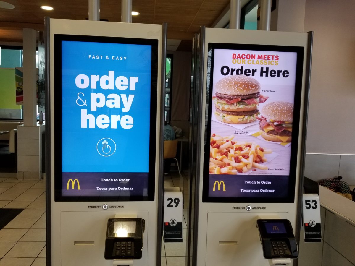
Back to the McDonald’s kiosk example. I’m not in love with McDonald’s by the way, but their kiosks are a solid example when it comes to usability. Look at the accompanying photo. In this case, both the function and the benefit are clear.
The function is, “I can order and pay here.” The benefit is it’s fast and easy. Wow, what a great reason to avoid getting in the cashier’s line!
3) Use short, large, readable text
 |
The inexperienced kiosk designer will try to cram a bunch of text on the screen. To make matters worse, they reduce the font size to make it all fit.
Our objective for the kiosk attract screen is not to feed the customer a bunch of information. Rather it’s to get them to interact with our kiosk. You can always give them more information once you’ve got their attention.
If you look back over the previous photos, you’ll notice the text is large and easy to read. Get right to the point of why the customer should use your kiosk and make it short, sweet and easy to read.
4) Use eye catching pictures
 |
Incorporate eye-catching photography. If you’re product looks appealing, then why not show it off? You spent a pretty penny on the photo shoot, so make good use of those gorgeous product photos.
Granted, if your “product” is renting library books, a photo of some books might not do you justice. In that case, the photo should still convey the benefit the customer will experience by using your kiosk (i.e., fast and easy, skip the line, etc.).
5) Consider your customer demographics
 |
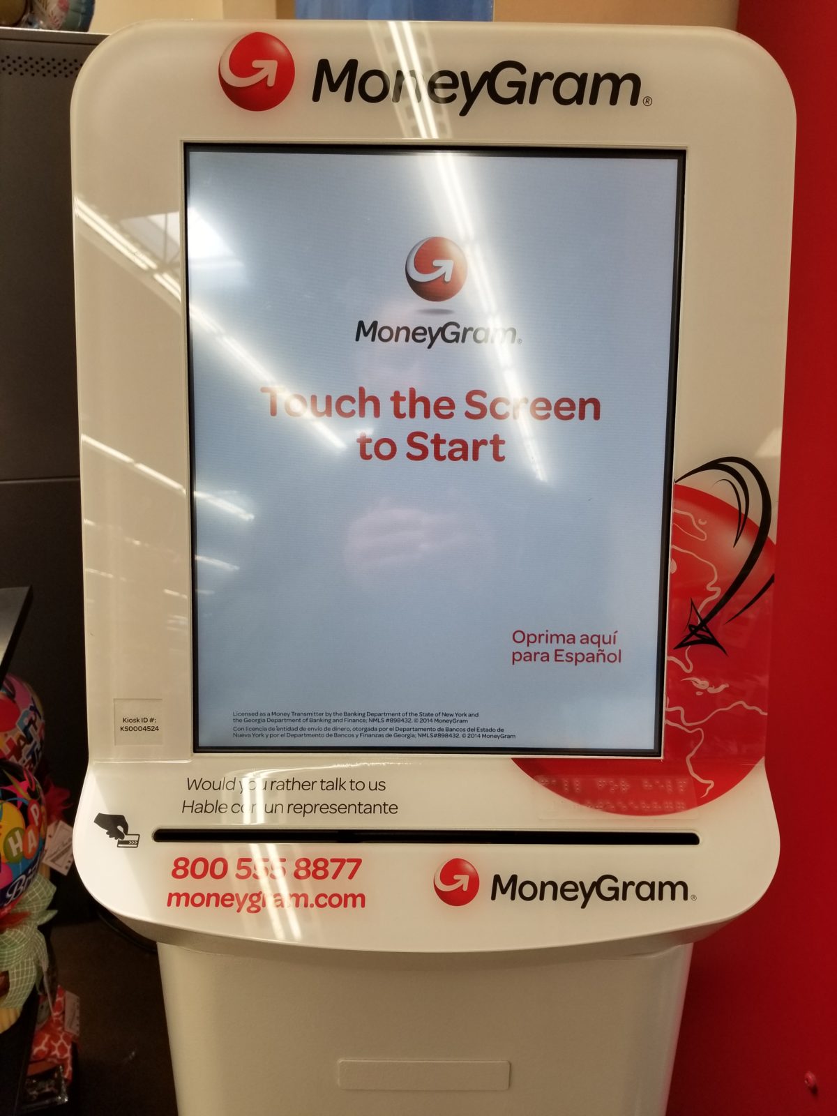
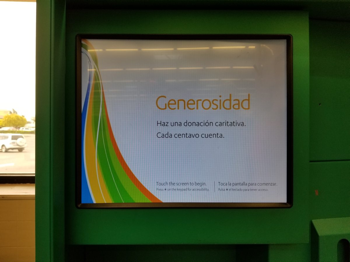
My last tip when it comes to messaging is to stay relevant to your customer demographics. This requires knowing who your customers are and what they care about. Are your kiosks being used by the unbanked in low income areas? Is English their first language?
It’s critical to understand the demographics of your customers in order provide the best possible self-service experience.
According to the website, Marketing Artfully, the top customer demographic categories to look for in 2019 include:
- gender
- race (ethnicity)
- age (date of birth)
- household income
- home ownership (length of residence, home size, mortgage).
- disabilities
- education
- employment status
- children
- location
- type of car(s)
- marital status (head of household, spouse)
- savings, CDs, 401k
6) Know when you’re out of order

Kiosk downtime is inevitable and may be costing you more than you know. But a down kiosk can put a serious dent in customer engagement and erode trust in your brand.
Therefore, it’s critical to know when your kiosks are down and it’s easy with remote monitoring tools like TeamViewer and LogMeIn that will alert you in real-time.
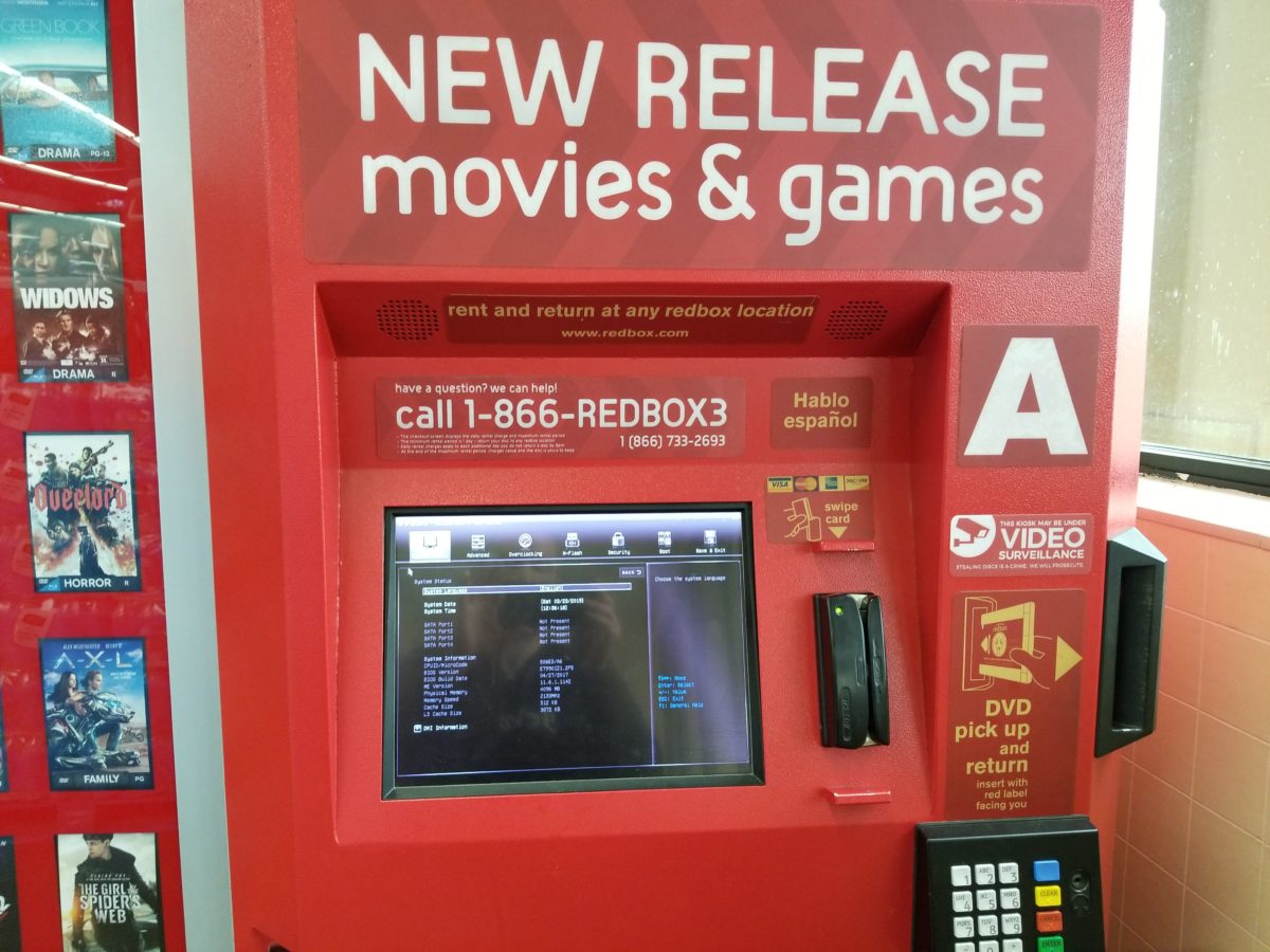
True story, this tip was a last-minute addition as I was taking photos for this article. I had to wait a long time to use the one working Redbox because the other one was stuck on the bios screen and a line had formed. There are also kiosk security ramifications here as this is not your standard out of order screen, but rather allows you to edit the bios.
Your kiosk is not a giant tablet or smart phone, and the tactics for getting customers to engage are unique to self-service. When customers interact with their mobile device, they do so on their own terms. They can digest as much information as they like and there’s no rush to get them away from their device. In fact, the longer they’re on the device the better, especially when it comes to ad revenue.
This is not the case with self-service kiosks, where it’s vital to increase customer throughput and minimize wait times. You want the customer to use your kiosk to order, pay and move on as quickly as possible.
Keep these tips in mind and you’ll see greater engagement at your kiosks.
